Difference between revisions of "Phantasy Star Collection/Comparisons"
From Sega Retro
(Created page with "{{back}} ==''Phantasy Star''== Note: To simulate more detail, the Game Boy Advance version rapidly changes between two discrete images. This means detail is lost in static...") |
|||
| Line 7: | Line 7: | ||
| image1=Phantasy Star Title.png | | image1=Phantasy Star Title.png | ||
| image2=PhantasyStarCollection GBA PS1 Title.png | | image2=PhantasyStarCollection GBA PS1 Title.png | ||
| + | | game1=Master System | ||
| + | | game2=Game Boy Advance | ||
| + | | desc=''Phantasy Star'' is the only game in the set where all the graphics have been resized for the smaller GBA screen resolution. It is also the only game where the colour palette has not been noticeably lightened to compensate for the console's non-lit screen. | ||
| + | }} | ||
| + | |||
| + | ===Starting area=== | ||
| + | {{Comparison | ||
| + | | image1=PhantasyStar SMS Start.png | ||
| + | | image2=PhantasyStarCollection GBA PS1 Start.png | ||
| game1=Master System | | game1=Master System | ||
| game2=Game Boy Advance | | game2=Game Boy Advance | ||
| Line 47: | Line 56: | ||
| game1=Mega Drive | | game1=Mega Drive | ||
| game2=Game Boy Advance | | game2=Game Boy Advance | ||
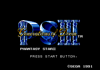
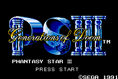
| − | | desc= | + | | desc=The ''Phantasy Star III'' conversion is similar to ''Phantasy Star II'', though it hasn't had to resize the title screen. |
| + | }} | ||
| + | |||
| + | ===Starting area=== | ||
| + | {{Comparison | ||
| + | | image1=PhantasyStarIII MD Start.png | ||
| + | | image2=PhantasyStarCollection GBA PS3 Start.png | ||
| + | | game1=Mega Drive | ||
| + | | game2=Game Boy Advance | ||
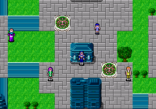
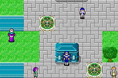
| + | | desc=In-game the brightened colours are more noticeable. | ||
}} | }} | ||
Revision as of 06:18, 30 March 2019
- Back to: Phantasy Star Collection.
Contents
Phantasy Star
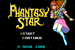
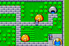
Note: To simulate more detail, the Game Boy Advance version rapidly changes between two discrete images. This means detail is lost in static screenshots.
Title screen
| Master System |
|---|
| Game Boy Advance |
|---|
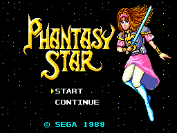
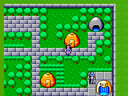
Phantasy Star is the only game in the set where all the graphics have been resized for the smaller GBA screen resolution. It is also the only game where the colour palette has not been noticeably lightened to compensate for the console's non-lit screen.
Starting area
| Master System |
|---|
| Game Boy Advance |
|---|
Phantasy Star II
Title screen
| Mega Drive |
|---|
| Game Boy Advance |
|---|
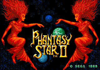
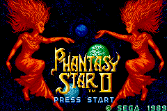
Phantasy Star II attempts to use as many of the raw Mega Drive assets as possible, but is forced to scale some elements to fit on the Game Boy Advance's smaller screen.
Name select
| Mega Drive |
|---|
| Game Boy Advance |
|---|
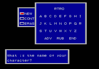
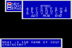
Most of the text windows are smaller. The fonts are the same, but the with the space between elements is reduced.
Starting area
| Mega Drive |
|---|
| Game Boy Advance |
|---|
The overworld is much the same as the Mega Drive, just with less viewable at any one time.
Phantasy Star III: Generations of Doom
Title screen
| Mega Drive |
|---|
| Game Boy Advance |
|---|
The Phantasy Star III conversion is similar to Phantasy Star II, though it hasn't had to resize the title screen.
Starting area
| Mega Drive |
|---|
| Game Boy Advance |
|---|
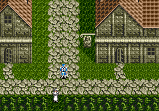
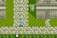
In-game the brightened colours are more noticeable.
References
| Phantasy Star Collection | |
|---|---|
|
Main page | Comparisons | Hidden content | Bugs | Magazine articles | Reception | |
