- Back to: Sega Smash Pack.
Ecco the Dolphin
Title screen
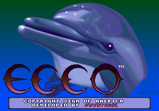
No attempt is made to scale down the Mega Drive's title screen for the Game Boy Advance's smaller screen resolution, meaning the "Ecco" text clips off the left hand side of the screen.
Golden Axe
Title screen
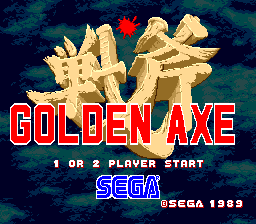
The Smash Pack version of Golden Axe is based on the Mega Drive port, rather than the Sega System 16 arcade original. There appears to be a palette error on the title screen, causing what should be the darkest sky colour to be rendered as bright cyan. This was never fixed in any version.
Select player
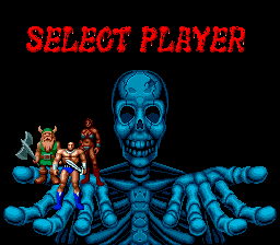
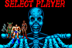
Menus in the Mega Drive Golden Axe render at 256x224, and so when rendered on a TV, are stretched horizontally to 320x224. This was not considered in Smash Pack, meaning all the graphics on the select player screen are too "thin".
Stage 1 start
Again Smash Pack uses Mega Drive graphics despite having less screen real estate. As well as extra scrolling, it means much of the screen is taken up by dirt and rocks.
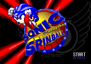
Sonic Spinball
Title screen
References
