Sega logo
From Sega Retro
As with most big corporations, Sega uses a logo so that people can associate a product with the Sega brand.
Contents
1945? logo
Variants of the original Service Games used a typical, hand-drawn logo as was often the style for the 1940s. This pre-dates modern views on "branding" so likely just existed to bring consistency to the company's letterheads.
Examples of usage
195x logo
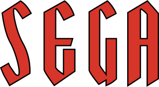
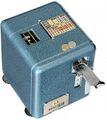
Sega's first easily reproducible and standardised logo came into force during the late 1950s. Its exact date of creation is unknown, however early examples of its use include the Mini-Sega slot machine (thought to be released in 1958) and the Sega 1000 jukebox from 1960.
This logo is typically red, and is thought to be using a unique typeface invented by Sega. The height of the letters seems to vary.
Examples of usage
1976 logo
At some point in 1976, Sega adopted what their current logo - a blue wordmark, sometimes sporting a white border.
As with previous logos, the true design origins are unknown, however the '76 logo is thought to derive from the Yagi Double typeface, developed by Robert Trogman and published by his Los Angeles-based design company FotoStar in 1968. Yagi Double, alongside many of Trogman's typefaces, was widely used during the 1970s - another famous example of its use is the current logo for US broadcaster CNN.
Modifications were made to the typeface for Sega's purposes. The "E" is elongated and the "G" is squared off to more closely match the E. The "A" would also see modications, becoming thinner as the decade came to a close. These modifications were loosely enforced during the early years - some third-party distributors of Sega products (as well as the early days of Sega Electronics) simply opted for the standard Yagi Double font, with often mixed results. While there have been slight tweaks to the shape over the decades, the logo has remained largely consistent since the early 1980s.
By the time Sega had entered the home console business in 1983, almost all occurances of the logo were printed in blue (aside from when printed in monochrome). Prior to this date it was not unusual, particularly in North America, to see the logo in red, similar to the previous design, and on occasion yellow variants would also be used in arcade flyers and cabinets.
Though there were many exceptions, the logo was to be printed with the ™ trademark symbol until the 1st November 2000, where it became a registered trademark[1]. This coincided with the company's name change from "Sega Enterprises, Ltd." to "Sega Corporation".
Official guidelines
Officially Sega uses two official blue colours for its logos; one for Japan, and one for international markets (although in practise there are often many more, due to printing limitations or errors, or failure to adopt branding guidelines).
| Colour | Name | RGB hexadecimal | Usage | Example |
|---|---|---|---|---|
| Toyo Ink CF10382; "Sega Blue" (セガ・ブルー) | #008dd0 | Domestic markets (Japan) | 
| |
| #0060a8 | International markets (North America, Europe etc.) | 
|
International markets typically use a darker blue for the Sega wordmark. The exact reasoning for this is not fully understood - it is thought Sega of America made the change to better suit its market in the 1980s, although it could easily be a mistake which stuck and was adopted into the official guidelines. It is speculated that the Japanese colour scheme is meant to convey a more child-friendly attitude based on research into colour theory.
In video games, where colour palettes can be limited, the typical aim was just to make the logo a shade of blue, rather than worry about the precise tone. This distinction is usually only made in print, such as with video game box art or promotional material. When printed on a dark background, a variant with a white border is preferred. A second blue border has also been used in the past in certain situations.
The logo also varies in shape depending on the required size. Official guidelines dictate that a logo with thicker internal lines should be used between 2.5mm-7mm (or silkscreen) printing, with a more uniform design used for sizes greater than 7mm[2][3]. Distances are presumed to be heights.
| < 7mm (1997 EU spec) | >= 7mm (1997 EU spec) |
|---|---|

|

|
Examples of usage
Sonic the Hedgehog (1991)
Tokyo Joypolis (1996)
Others
Mysterious 1960s logo used on Punching Bag (1962) and other material
Logo used with the release of the SG-1000 in New Zealand (1983)
References
| Sega, the company |
|---|
| Company profiles | Harmony | History | Jingle | Scream | Logo | Offices | Souzou wa Inochi | Wakai Chikara |
| Annual reports | Investor relations |


